
Understanding Admin Dashboard - This article was first published on Medium/MindzHub Publication By Dilshad Khan.
Don’t forget to read the 8 Must-have key features for using the BI in Understanding Admin Dashboard tools.
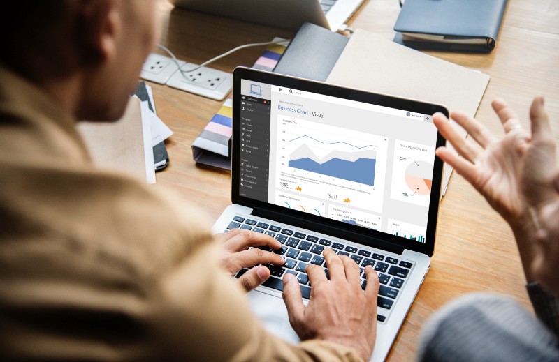
The Dashboard is the initial screen. It gives a specific view of geographic information that helps to monitor events or activities in an organization. Admin Dashboards are designed to display multiple visualizations. These are based on the comprehensive and engaging view of your data to provide key insight. It helps in decision making in a quick preview of the work on a single screen.
Who can view the Admin Dashboard?
There are key-items within your organization. They can be identified by their specific icon when browsing and searching for content. The Dashboard contains configurable panels that display widgets. They present data to users specific to their needs and actions to be taken. These can be configured globally, per-login group, or by the user for a personalized view. Subsequently, users must be given access on a per-login group basis. It helps to manage or configure their own Dashboard. By default, hiring managers and vendors do not have access to make configurations to their Dashboard. User admins can manage Dashboard configurations for any login group. The need of understanding admin dashboard is necessary.
Need to create Admin Dashboard
There are different reasons to create an Admin Dashboard. It is not generalized for one particular group of organizations or industries. These are some common reasons why Understanding Admin Dashboard in every sector or industry is required.
1. It gives a comprehensive view to see all the data you need to make decisions on one good comprehensible screen.
2. They monitor the most important information about the daily operations and activities.
3. They ensure the focus of all your team members are on the same goal through viewing and using the same information to achieve targets.
4. It helps to monitor the health of a business, product, organizational team, or campaign.
5. Dashboards create a personalized view of a larger set of data to show all the metrics that matter to you on one screen.
Types of Admin Dashboards

There are four general subtypes of Dashboards according to different needs at the different levels of an organization.
1. Strategic
2. Operational
3. Analytical
4. Tactical
Some Dashboards are operational in nature while others are tactical or strategic. They are specifically designed to tell what is happening now. They match fast and diverse changes in the nature of happenings, incidents, events, and other activities. Admin Dashboards are more strategic. They are ideal for executives and other senior managers interested in monitoring their organization’s KPIs and metrics. Some Admin Dashboards are more analytical in design. They are used to identify data trends or other interesting data characteristics.
Many are simply informative dashboards. They are used to tell a meaningful story with the data. An organization has different types of teams. These teams consist of people within and outside of the organization. Each team has a different need for a different type of Dashboard. Understanding admin dashboard helps the teams. Example users include command chiefs, CMO, CFO, CTO, CEO, VP, operations managers, senior executives, directors, marketing owners, campaign managers, and even community members. The list goes on.
Admin Dashboards are composed of different elements such as maps, lists, charts, gauges, indicators. These elements can be stacked or grouped together in various ways.
Key features of an effective Dashboard
You should keep in mind these characteristics while making the structure of the dashboard:
1. It should draw your attention to where it is needed.
2. It should show what is the most important part on a screen full of data.
3. It should provide its audience with the ability to understand what is happening and respond quickly enough to make a decision.
4. It should express performance measures clearly, accurately, distinctively, and without undue distraction.
Must have key features for using the BI
Hans Peter Luhn (an IBM researcher) coined the term in 1958 after seeing that BI made it possible. The opportunities to adjust and fine-tune decisions to reach strategic goals effectively and quickly. Yes, we should use the BI relevantly before laying down the data structure.
Modern trends of using big data wisely for the growth of the company is picking up the race. Some key features to look out for that will definitely put you to advantage and help you to expedite your tool evaluation process. It makes using the BI all the more relevant.
1. Making a cloud-based and mobile-ready tool is advantageous.
The changing trends of wisely using big data according to BI and uninterrupted access to business analytics is strategically mission-critical. Be sure the tool you make is cloud-based and offers a mobile application version for access through cross-browser, tablet, or smartphone. Admin Dashboard should be trendy, responsive, and adaptable to the different sizes of the screen, adaptive to landscape view or portrait view, via any 4G/LTE network or public Wi-Fi network or hotspot. Ensure Understanding Admin Dashboard enables the user to view the reports anytime, and anywhere.
2. Customizing real-time data feeds.
The real-time reporting system needs the tools to connect real data and feed it into a reporting system creating as many near-real reports as possible. Fresh or old data could be in a matter of days, hours, or minutes old. The customers, clients, or employees demand a quick feed of data related to products, services, information, and response time from a company. It is time to change your batch processing data tools to match with the modern trends.
3. Drag and drop editing feature for easy visualization.
Make your tool with easy and simple drag and drop features and indicators on your dashboard so that you can connect data from any data source. Your tools should be able to create clean, live, visualized dashboards and reports with fewer efforts. Just a few clicks should do the work. If you find it difficult to make a clean and easy report with your tools then it is time to re-think them.
4. Automated connectivity to multiple analytics platforms and data refreshes.
Your dashboard should be easily able to connect to a large number of systems and databases like Google Analytics, Salesforce, Facebook, Twitter, Oracle, MySQL, and files on Dropbox, Google Drive, and others. You should wisely schedule the refresh dates and times that make the most sense for your business, team, or users.
5. Periodic scheduling of dashboard publications.
Your publication tools should allow you to create schedules of various dashboards and automate the periodic publication of them to the users or groups of users. This regular periodic scheduling will allow your user to have fresh and real visualizations of your Dashboard. It makes your Dashboard more relevant and real to the needs of your user.
6. Cross-platform access and compatibility.
Understanding Admin Dashboard tool allows you to follow with ease of access and cross-platform compatibility i.e. Windows, Mac, Linux compatibility. Take care of compatibility issues before deploying your Dashboard tools. The key to success is compatibility. The more compatible your tools the better. Give periodic support to tackle the further compatibility problems according to the changes in the platforms.
7. Customized alerts.
Modern BI tools allow the user to create customized alerts. These immediately trigger the notifications of the changes to the users that they need to monitor around the clock. Every business has unique KPIs. It needs to track certain reports on-demand and notify the user group accordingly.
8. Users related data display.
Design your admin dashboard to present data and display according to per-user, per-team of users, or groups. It should allow the user to dig into your charts, indicators, and tables, display sub tables, other dashboards according to their role-specific information to avoid confusion.
Give single click functionality. It’s even better if you can zoom in and out of charts, graphs, maps, easily move time scales, group by months, quarters, or years have all easily done in a single click. Customization of theme colors at different levels. Flexibility and usability are the main focal points to remember. You should design the features that have all the control your user needs at the macro and micro levels.
There are many BI and dashboard reporting tools with many other features. Make your Admin Dashboard with features that will offer the most value, flexibility, and ROI for your user’s business. Understanding admin dashboard helps in using these tools.

Dilshad Khan is the Founder of Mind2Minds – The Professionals Hut from India with a Masters Degree in Computer Science. He has more than 17 years of experience in Full Stack Development. Reading is another passion. His all time favourite book is “Six Thinking Hats” by Edward de Bono.
